Customization of the Dashboard trough interactive graphics

Customization of the Dashboard trough interactive graphics
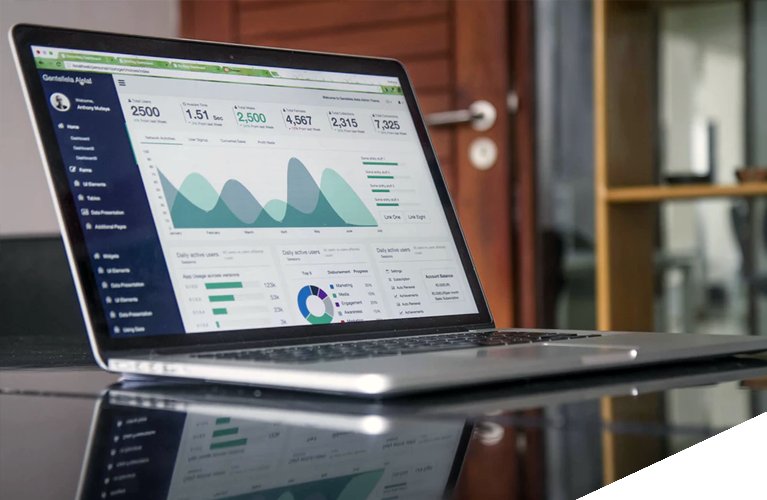
From SCollect we continue to make the day to day of the professionals a little easier, the latest SCollect update allows data managers and researchers to visualize the status of the study through interactive and customizable graphics updated in real time on the same Dashboard, fast, easy and visually intuitive.
These graphs can be customized according to users and roles, being able to visualize different types of graphs and data shown in them according to the interest of the professional, facilitating their work in just a few clicks.
Customize your dashboard, visualize your trial

You can choose between different types of graphs, from bar graphs, to linear graphs, circular graphs, interactive maps… among others, facilitating the data manager work and providing him with a global image of the project in progress at all times.
In SCollect we work to ease the work of professionals in the health sector, and we know that the amount of time spent in the management and analysis of data is of vital importance. That is why we emphasize on customization to improve data management, improving efficiency in time management and effectiveness of the processes within the eCRD.

